Mahima Gautam
AI-Powered Analysis
for Faster Decisions
in Manufacturing
An Industrial AI platform that simplifies shop floor intelligence with natural language queries, KPI analysis, and automated reports thus helping teams act faster and boost efficiency.

Do the right analysis instantly
Empowering every user with instant, AI-driven insights for smarter decisions.
Which machines had the maximum downtime?

@
Add..


Availability
What was the availability trend of the line in the previous month?
What were the key availability bottlenecks in the previous month?
Which machines contributed to the most down time in the previous month?

Performance
What was the performance trend of the line in the previous month?
What were they key performance bottlenecks in the previous month?
Which machines performed the worst in the previous month?

Quality
What was the quality trend of the line in the previous month?
How compliant was my line in the previous month?
Provide machine-wise quality trends for the current month.
The Challenge
Not everyone is a Data Analyst.
Manufacturing teams waste hours navigating complex dashboards to find simple answers about their production data
The Challenge
Plant managers, maintenance technicians, and quality engineers spend an average of 20 minutes per query navigating through complex dashboards, multiple screens, and dense reports to find critical manufacturing insights, hence delaying the identification and resolution of issues.
Complexity Overload
5+ clicks to access basic performance metrics
Steep Learning Curve
At least 2-3 weeks training required for new users
Delayed Decisions
Slow data access leads to production bottlenecks
No Mobile Access
Supervisors couldn't access data on-the-go
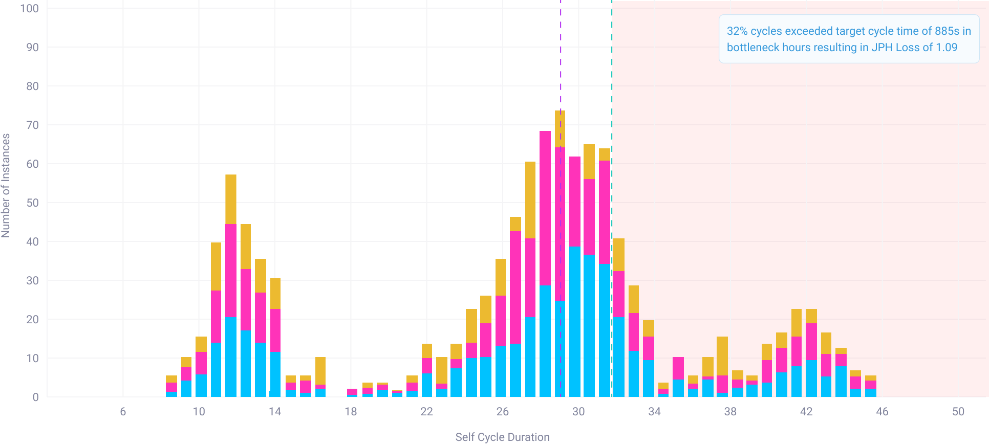
Complexity in reading graphs
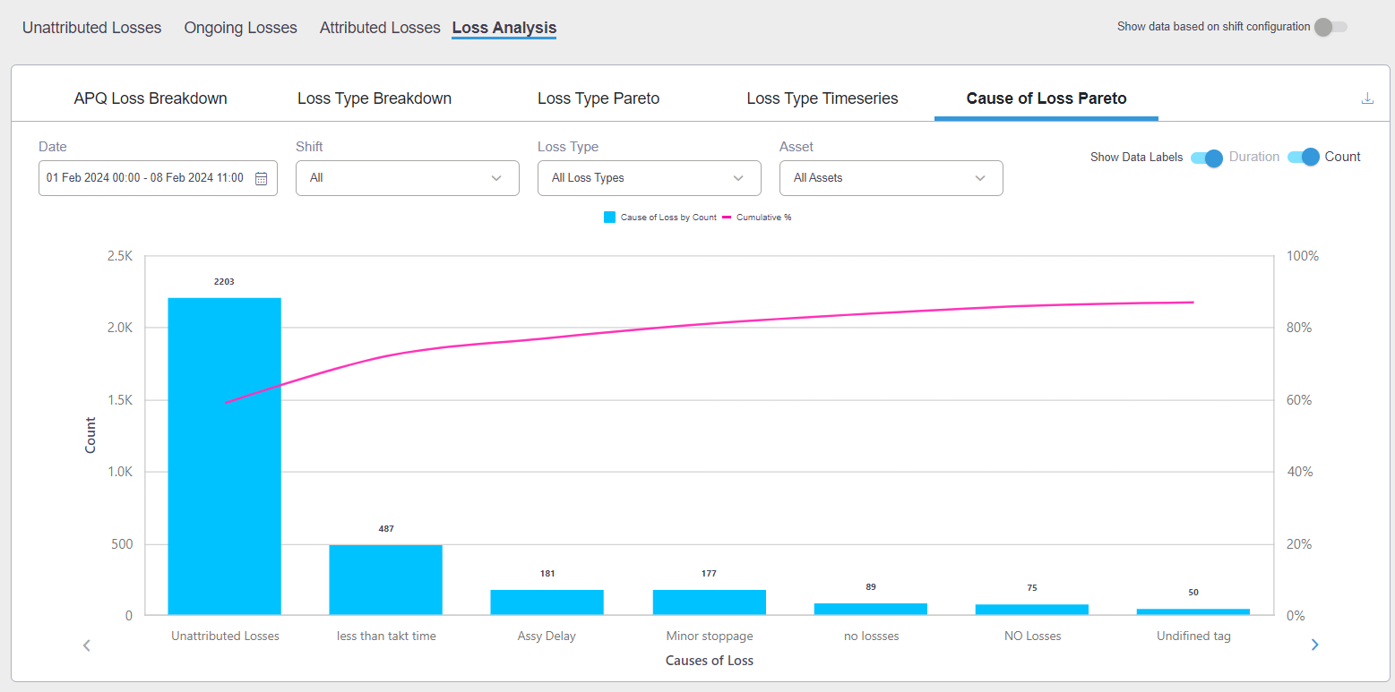
APQ Loss Breakdown
Loss Type Breakdown
Loss Type Pareto
Loss Type Timeseries
Cause of Loss Pareto

Show data labels

Duration

Count

Generate AI Insights
Date
17/02/22 - 21/02/23


Filters (3)
Hard to correlate data
Show Cell Details
OP50 Cell

OP50 Machine
View Critical Asset
37%
Availability
37%
Quality
37%
Self Perf.

OP50 Machine
View Opportunities
37%
Availability
37%
Quality
37%
Self Perf.
View Critical Assets (02)
OP20 Cell
37%
Availability
37%
Quality
37%
Self Perf.
View Critical Assets (02)
OP10 Cell
37%
Availability
37%
Quality
37%
Self Perf.
View Critical Assets (02)
OP30 Cell
37%
Availability
37%
Quality
37%
Self Perf.
Agg. Cycles Drilldown

Filter Outliers

Bin Count

8


90
60
30
0


Frequency
Target Cycle Time

Average Cycle Time

33% of the cycles are overcycling
10
20
30
40
50
60
70
80
90
700
OP50 Machine Self Performance

Date Selector:
22 Jul , 11 : 00 - 11 Aug , 19 : 00 , 2020

Self Performance
Total Performance
Downtime frequency
Downtime Duration
Bad Parts


Filters

Count
Duration(sec)


Clear

Save


Dashboard


Optimize

OEE


Production Schedules


Optimize Report


Bottlenecks

Critical Assets
View by
Default(APQ)

Show Cell Details
OP50 Cell

OP50 Machine
View Opportunities
37%
Availability
37%
Quality
37%
Self Perf.

OP50 Machine
View Opportunities
37%
Availability
37%
Quality
37%
Self Perf.
View Critical Assets (02)
OP50 Cell
37%
Availability
37%
Quality
37%
Self Perf.
View Critical Assets (02)
OP50 Cell
37%
Availability
37%
Quality
37%
Self Perf.
View Critical Assets (02)
OP50 Cell
37%
Availability
37%
Quality
37%
Self Perf.
View Critical Assets (02)
OP50 Cell
37%
Availability
37%
Quality
37%
Self Perf.
OP50Cell, 22 Jul (20:00 to 21:00)


OP50Cell, 22 Jul (20:00 to 21:00)


< 65%
65% to 85%
85% to 95%
>95%
Critical assets
OP 50 Gantry
OP 50 M1
OP 50 M2
OP 40 Gantry
OP 60 Gantry
OP 40 M1
OP 40 M2
OP 60 M1
OP 60 M2


Too much time spent looking for one answer
APQ Loss Breakdown
Loss Type Breakdown
Loss Type Pareto
Loss Type Timeseries
Cause of Loss Pareto

Show data labels

Duration

Count

Generate AI Insights
Date
17/02/22 - 21/02/23


Filters (3)
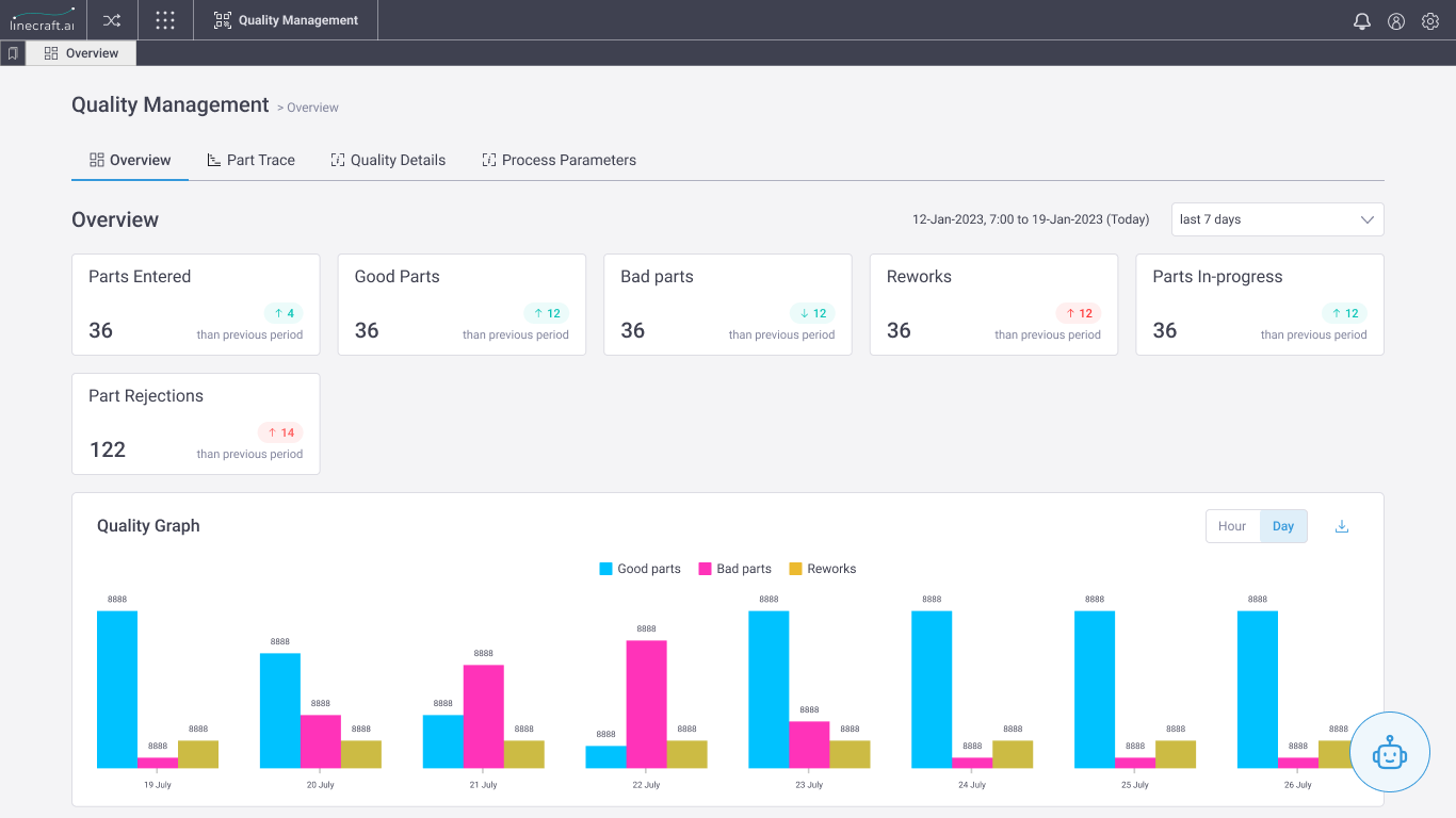


Creates dependencies on teams for support
The Solution
RISHIIndustrial AI Platform
Our Solution
RISHI is an Industrial AI platform designed to simplify shop floor analysis by enabling manufacturing teams to ask questions in natural language and receive instant, contextual insights. By combining personalized landing experiences, smart suggestions, and AI-powered visualizations, RISHI eliminates complex dashboard navigation and steep learning curves. The platform supports KPI analysis, trend monitoring, interactive data exploration, and one-click automated reports thus making production data accessible, actionable, and usable by everyone on the shop floor, not just data analysts.
Key Features
Natural Language Queries
Context Aware Suggestions
Intelligent VIsualisations
AI-Powered Reports
Interactive Data Tables


Use cases
So, why RISHI?
Powerful Capabilities, Simplified
Unlocking powerful insights through simple questions, automated reports, and ready-made analytics designed for real-world manufacturing team




What was the availability of @....


Machines

Cells

IoT Parameters

Shift

Part Type

Natural Language Queries for Easy Interaction
Ask questions like you talk. No code, no training—just straight answers from your data.



Statistics
Real-time
1,027

12.75%


574

KPI, Trend, Root Cause and Statistical Analysis
Instantly export detailed reports and spreadsheets tailored to your production line—ready to share or analyze further.


Expert-curated queries


Availability
What was the availability trend of the line in the previous month?
Performance
What was the performance trend of the line in the previous month?
Quality
What was the quality trend of the line in the previous month?
Ready-to-use Preset Smart Questions
Dig deep into performance with built-in analytics that highlight what’s working, what’s not, and why.




Rishi generates reports of your line's data
Skip the guesswork with expert-curated queries that uncover key insights in just one click.
Problem 01
Constant Context Change
An average expert user handling multiple lines faces context changing as their role and the issues faced in each line might be different.

Feature 01
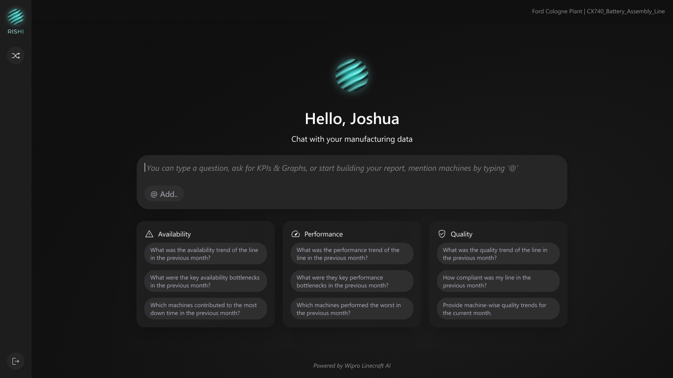
Personalized Landing Experience with Preset Queries
What it is
Context-aware greeting with plant and line information displayed immediately upon login. Preset queries catered to the user’s role.
What it does
Shows user name, current plant location, and preset persona specific queries related to current line at a quick glance
Why it matters
Reduces cognitive load by providing line context. Persona specific preset queries provide a head-start to users.
Problem 02
Steep Learning Curve and Complexity Overload
5+ clicks to access basic performance metrics. 2-3 weeks training required for new users
Feature 02
Natural Language Query Input
What it is
Large, prominent text input that accepts questions in plain English, no query syntax needed - allowing anyone and everyone to use the feature.
What it does
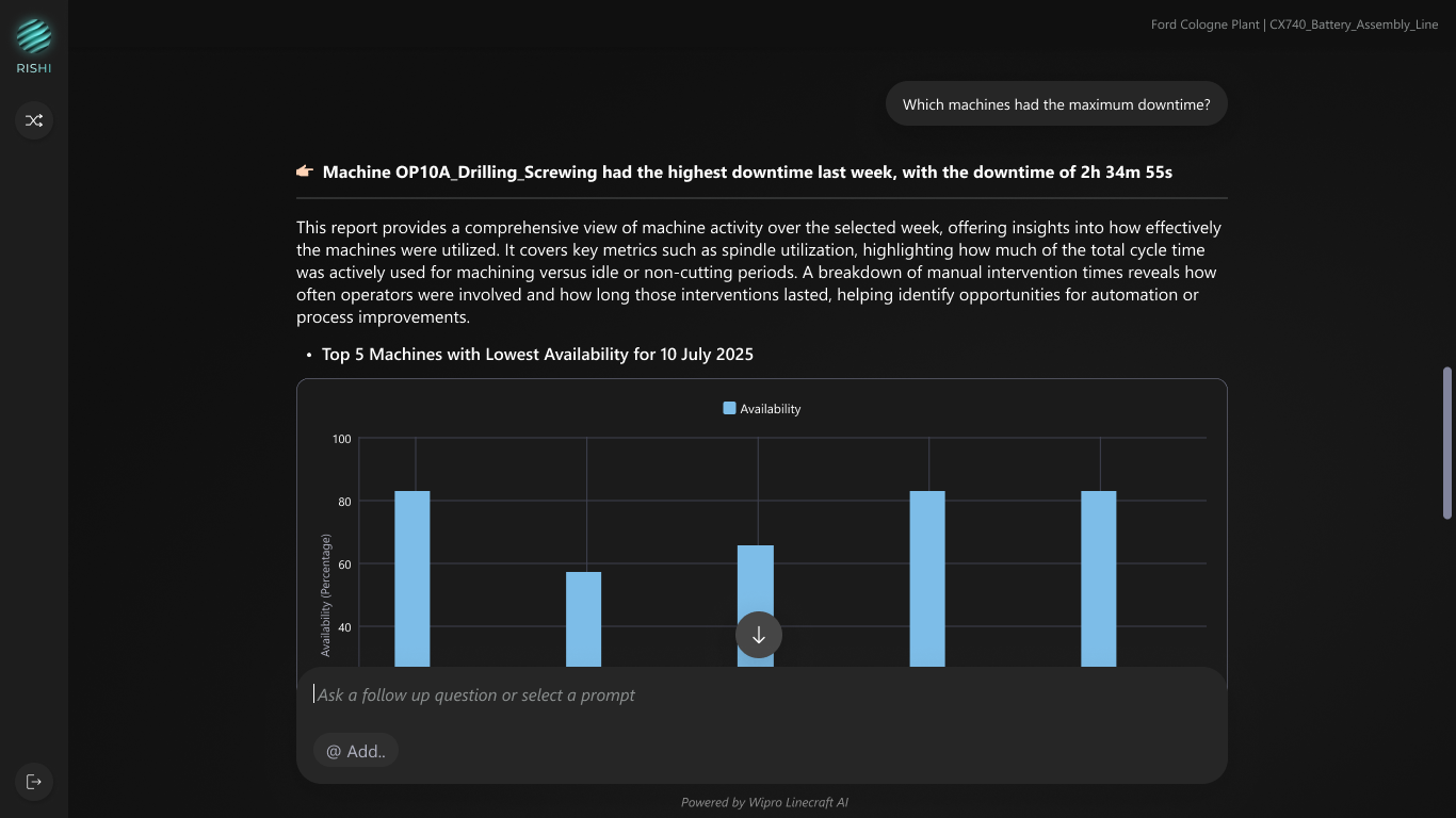
Processes natural language questions like "Which machines had the maximum downtime?" and returns relevant data almost instantly
Why it matters
Eliminates training requirements - anyone can query production data without learning complex dashboard navigation and confusion.
Problem 03
Ambiguity and Inefficiency in Entity Referencing
Users struggle to quickly and accurately reference specific machines or entities because typing full names is time-consuming, prone to errors, and difficult when exact names are not recalled, causing ambiguity and reducing efficiency.
Feature 03
@ Mention Tagging
What it is
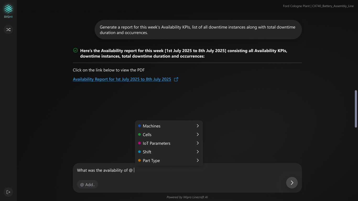
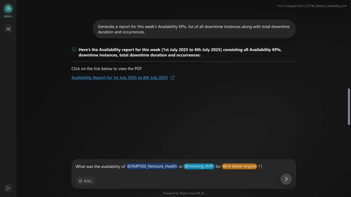
Type "@" to reference specific entities such as machines, IoT parameters, shifts, part types with color-coded tags
What it does
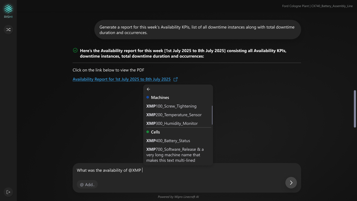
Provides autocomplete for all referenceable entities; creates visual tags that clarify query scope
Why it matters
Reduces ambiguity in complex queries, "@Machine_10A" vs. "that first machine"
Tag Color System
Blue
Machines
Aqua
Shifts
Orange
Part Types
Green
Cells
Problem 04
Difficulty Visualizing Trend and Comprehending Bulk Data
To find one answer user has to jump through heaps of data across screens & then try to understand what that data means.
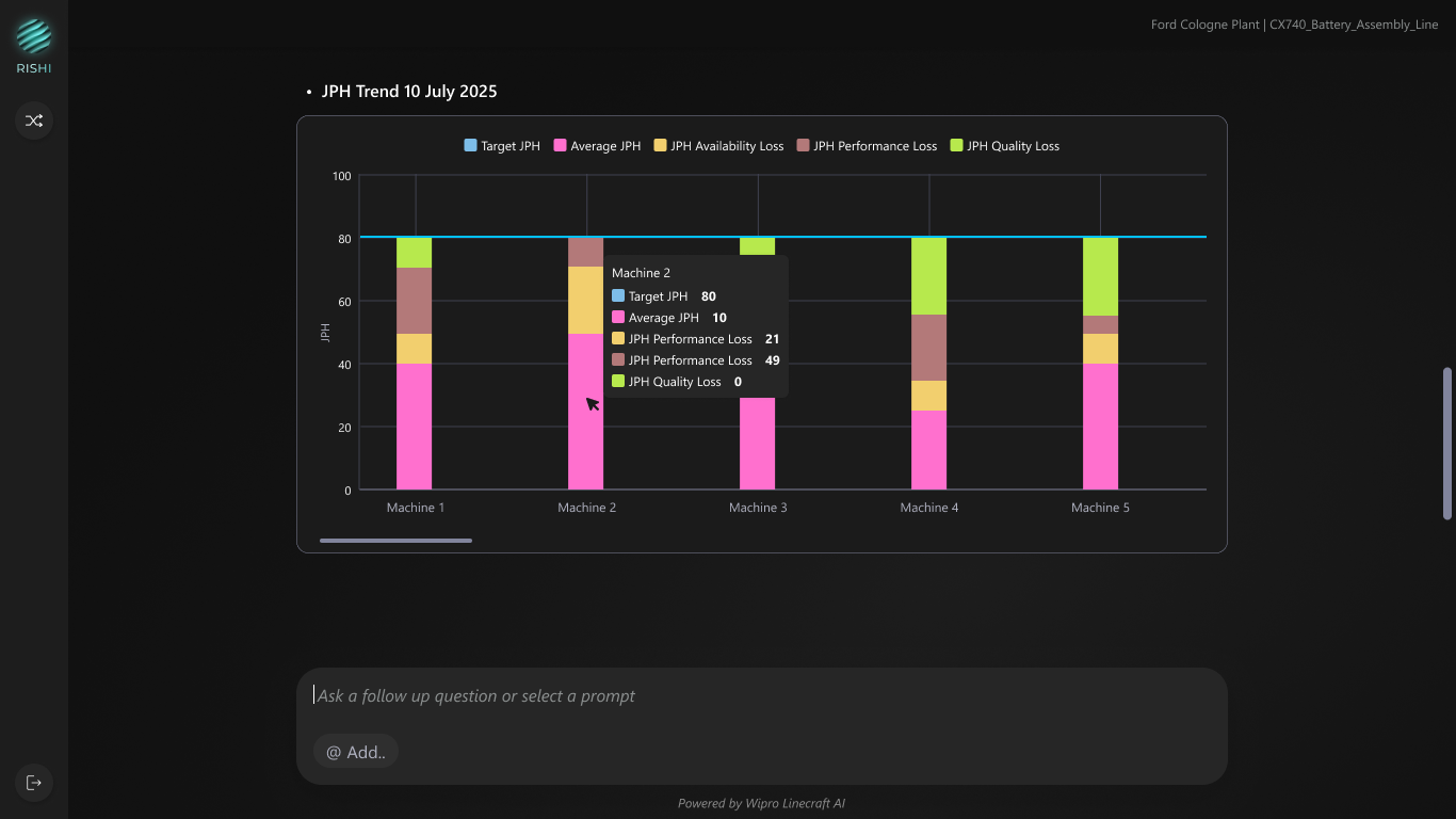
Feature 04
Intelligent Data Visualizations
What it is
AI-generated charts and tables that automatically format into bar charts, trend lines, data tables based on query type
What it does
Transforms raw manufacturing data into visual insights: JPH trends, availability comparisons, downtime analysis
Why it matters
Eliminates training requirements, anyone can query data without learning complex dashboard navigation
Problem 05
Manual Report Generation
The process of compiling data for reports to share with management is time-consuming, as it involves collecting information from various sources and extracting meaningful insights.
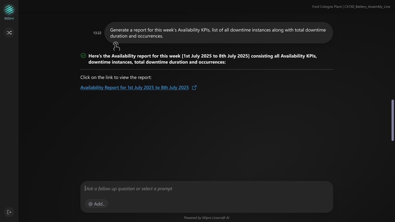
Feature 05
One-Click PDF Reports
What it is
Instantly generated comprehensive reports with AI-written insights, charts, and data tables
What it does
Converts conversational query into formatted PDF with executive summary, key insights and relevant supporting data
Why it matters
Eliminates manual report creation so managers can share insights with stakeholders immediately


Problem 06
Unsortable LLM Generated Tables
LLM generated tables are often presented as static outputs, limiting users’ ability to sort, filter, or search data. As a result, users must manually scan long lists to interpret information, increasing cognitive load and time spent on decision-making—especially when dealing with large or complex datasets.
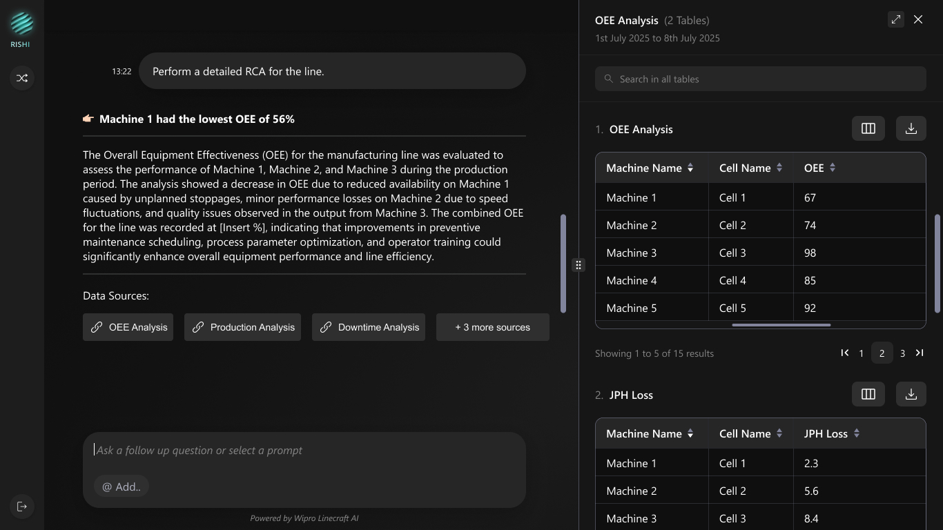
Feature 06
Side Panel Experience for Full Data Interaction
What it is
A contextual side panel that opens on data source selection, showing the full dataset in an interactive format.
What it does
Turns static LLM generated tables into sortable, searchable, and exportable data without breaking context.
Why it matters
Reduces cognitive load and interpretation time, helping users quickly analyze data and take action.
IMPACT
Measurable
Impact
Results after 1 month of deployment
87%
Faster Problem Identification
15 min → 2 min average
94%
User Satisfaction Score
Up from 68% baseline
65%
Reduction in Training Time
3 weeks → 30 minutes
90%
Reduction in CS Team Support
Manual Reporting → AI Analysis
Before vs After
Before: Traditional Dashboard
15-minute average query time
Users navigated 5+ screens to find simple metrics
2-3 weeks training required
New users needed extensive onboarding sessions
42% adoption rate
Many workers avoided the system entirely
Desktop-only access
Factory floor supervisors couldn't access data
Manual report creation
Analysts spent hours or days building weekly reports
After: Conversational AI Interface
2-minute average query time
Natural language query → instant results
30-minute training session
Users productive on day one
95% adoption rate
Cross-functional teams actively using daily
Mobile responsive design
Quick queries happen on phones
One-click PDF reports
AI generates comprehensive reports in less than 1 minute

KEY LEARNINGS
Key learnings
Insights from 6 weeks of design, development, and deployment
1. Conversational UI reduces cognitive load dramatically
Users with 15+ years of manufacturing experience adapted to the chat interface faster than traditional dashboards. The familiar messaging pattern eliminated learning curves as everyone already knows what to ask. We saw 95% task completion rates in first-time user testing.
2. Progressive disclosure beats feature overload
We initially planned all advanced features upfront, however during testing we noticed that the users were overwhelmed. By starting with simple natural language input and revealing advanced features (filters, @mentions, table functions) only after the first version, we increased engagement. Let users discover complexity at their own pace.
3. Context is everything in manufacturing
Displaying plant, line, and user information at all times wasn't just a nice-to-have—it was critical. Manufacturing data without context is meaningless. When we removed the persistent header in early testing, users felt "lost" and made query errors. Context awareness reduced errors by 60%.
4. Mobile support is mandatory for factory floors
Many quick queries happen on mobile devices. Factory supervisors are rarely at desks as they're troubleshooting machines, inspecting production lines, attending shift handovers. Designing for mobile ensured the interface worked and supports resolution where manufacturing actually happens.
5. Dark theme isn't just aesthetic, it's functional
Manufacturing facilities have challenging lighting: bright overhead LEDs, machine displays, sunlight through high windows. Dark interfaces reduced eye strain complaints. Users monitoring screens for 8-12 hour shifts reported significantly less fatigue. Color choice matters in industrial environments.



Mahima Gautam
AI-Powered Analysis
for Faster Decisions
in Manufacturing
An Industrial AI platform that simplifies shop floor intelligence with natural language queries, KPI analysis, and automated reports thus helping teams act faster and boost efficiency.

Do the right analysis instantly
Empowering every user with instant, AI-driven insights for smarter decisions.

Which machines had the maximum downtime?

@
Add..


Availability
What was the availability trend of the line in the previous month?
What were the key availability bottlenecks in the previous month?
Which machines contributed to the most down time in the previous month?

Performance
What was the performance trend of the line in the previous month?
What were they key performance bottlenecks in the previous month?
Which machines performed the worst in the previous month?

Quality
What was the quality trend of the line in the previous month?
How compliant was my line in the previous month?
Provide machine-wise quality trends for the current month.
The Challenge
Not everyone is a Data Analyst
Manufacturing teams waste hours navigating complex dashboards to find simple answers about their production data
The Challenge
Plant managers, maintenance technicians, and quality engineers spend an average of 20 minutes per query navigating through complex dashboards, multiple screens, and dense reports to find critical manufacturing insights, hence delaying the identification and resolution of issues.
Complexity Overload
5+ clicks to access basic performance metrics
Steep Learning Curve
At least 2-3 weeks training required for new users
Delayed Decisions
Slow data analysis & access cause production bottlenecks
No Mobile Access
Supervisors couldn't access shopfloor data on-the-go
Complexity in reading graphs
APQ Loss Breakdown
Loss Type Breakdown
Loss Type Pareto
Loss Type Timeseries
Cause of Loss Pareto

Show data labels

Duration

Count

Generate AI Insights
Date
17/02/22 - 21/02/23


Filters (3)
Hard to correlate data
Show Cell Details
Cell 50

Machine 50.1
View Critical Asset
37%
Availability
37%
Quality
37%
Self Perf.

Machine 50.2
View Opportunities
37%
Availability
37%
Quality
37%
Self Perf.
View Critical Assets (02)
OP20 Cell
37%
Availability
37%
Quality
37%
Self Perf.
View Critical Assets (02)
OP10 Cell
37%
Availability
37%
Quality
37%
Self Perf.
View Critical Assets (02)
OP30 Cell
37%
Availability
37%
Quality
37%
Self Perf.
Agg. Cycles Drilldown

Filter Outliers

Bin Count

8


90
60
30
0


Frequency
Target Cycle Time

Average Cycle Time

33% of the cycles are overcycling
10
20
30
40
50
60
70
80
90
700
MMachine 50.150 Machine Self Performance
Date Selector:
22 Jul , 11 : 00 - 11 Aug , 19 : 00 , 2020

Self Performance
Total Performance
Downtime frequency
Downtime Duration
Bad Parts


Filters

Count
Duration(sec)


Clear

Save


Dashboard


Optimize

OEE


Production Schedules


Optimize Report


Bottlenecks

Critical Assets
View by
Default(APQ)

Show Cell Details
OP50 Cell

OP50 Machine
View Opportunities
37%
Availability
37%
Quality
37%
Self Perf.

OP50 Machine
View Opportunities
37%
Availability
37%
Quality
37%
Self Perf.
View Critical Assets (02)
OP50 Cell
37%
Availability
37%
Quality
37%
Self Perf.
View Critical Assets (02)
OP50 Cell
37%
Availability
37%
Quality
37%
Self Perf.
View Critical Assets (02)
OP50 Cell
37%
Availability
37%
Quality
37%
Self Perf.
View Critical Assets (02)
OP50 Cell
37%
Availability
37%
Quality
37%
Self Perf.
OP50Cell, 22 Jul (20:00 to 21:00)


OP50Cell, 22 Jul (20:00 to 21:00)


< 65%
65% to 85%
85% to 95%
>95%
Critical assets
M50 Gantry
50 M1
50 M2
M40 Gantry
M60 Gantry
40 M1
OP 40 M2
60 M1
60 M2


Too much time spent looking for one answer
APQ Loss Breakdown
Loss Type Breakdown
Loss Type Pareto
Loss Type Timeseries
Cause of Loss Pareto

Show data labels

Duration

Count

Generate AI Insights
Date
17/02/22 - 21/02/23


Filters (3)


Creates dependencies on teams for support
SOLUTION
RISHI - Industrial AI Platform
Our Solution
RISHI is an Industrial AI platform designed to simplify shop floor analysis by enabling manufacturing teams to ask questions in natural language and receive instant, contextual insights. By combining personalized landing experiences, smart suggestions, and AI-powered visualizations, RISHI eliminates complex dashboard navigation and steep learning curves. The platform supports KPI analysis, trend monitoring, interactive data exploration, and one-click automated reports thus making production data accessible, actionable, and usable by everyone on the shop floor, not just data analysts.
Key Features
Natural Language Queries
Context Aware Suggestions
Intelligent VIsualisations
AI-Powered Reports
Interactive Data Tables
Use cases
So, why RISHI?
Powerful Capabilities, Simplified
Unlocking powerful insights through simple questions, automated reports, and ready-made analytics designed for real-world manufacturing team
What was the availability of @....
Machines
Cells
IoT Parameters
Shift
Part Type

Natural Language Queries for Easy Interaction
Ask questions like you talk. No code, no training—just straight answers from your data.
Statistics
Real-time
1,027
12.75%

574
KPI, Trend, Root Cause and Statistical Analysis
Instantly export detailed reports and spreadsheets tailored to your production line—ready to share or analyze further.
Expert-curated queries

Availability
What was the availability trend of the line in the previous month?
Performance
What was the performance trend of the line in the previous month?
Quality
What was the quality trend of the line in the previous month?
Ready-to-use Preset Smart Questions
Dig deep into performance with built-in analytics that highlight what’s working, what’s not, and why.


Rishi generates reports of your line's data
Skip the guesswork with expert-curated queries that uncover key insights in just one click.
Problem 01
Constant Context Change
An average expert user handling multiple lines faces context changing as their role and the issues faced in each line might be different.

Feature 01
Personalized Landing Experience with Preset Queries
What it is
Context-aware greeting with plant and line information displayed immediately upon login. Preset queries catered to the user’s role.
What it does
Shows user name, current plant location, and preset persona specific queries related to current line at a quick glance
Why it matters
Reduces cognitive load by providing line context. Persona specific preset queries provide a head-start to users.
Problem 02
Steep Learning Curve and Complexity Overload
5+ clicks to access basic performance metrics. 2-3 weeks training required for new users
Feature 02
Natural Language Query Input
What it is
Large, prominent text input that accepts questions in plain English, no query syntax needed - allowing anyone and everyone to use the feature.
What it does
Processes natural language questions like "Which machines had the maximum downtime?" and returns relevant data almost instantly
Why it matters
Eliminates training requirements - anyone can query production data without learning complex dashboard navigation and confusion.
Problem 03
Ambiguity and Inefficiency in Entity Referencing
Users struggle to quickly and accurately reference specific machines or entities because typing full names is time-consuming, prone to errors, and difficult when exact names are not recalled, causing ambiguity and reducing efficiency.
Feature 03
@ Mention Tagging
What it is
Type "@" to reference specific entities such as machines, IoT parameters, shifts, part types with color-coded tags
What it does
Provides autocomplete for all referenceable entities; creates visual tags that clarify query scope
Why it matters
Reduces ambiguity in complex queries, "@Machine_10A" vs. "that first machine"
Tag Color System
Blue
Machines
Aqua
Shifts
Orange
Part Types
Green
Cells
Problem 04
Difficulty Visualizing Trend and Comprehending Bulk Data
To find one answer user has to jump through heaps of data across screens & then try to understand what that data means.
Feature 04
Intelligent Data Visualizations
What it is
AI-generated charts and tables that automatically format into bar charts, trend lines, data tables based on query type
What it does
Transforms raw manufacturing data into visual insights: JPH trends, availability comparisons, downtime analysis
Why it matters
Eliminates training requirements, anyone can query data without learning complex dashboard navigation
Problem 05
Manual Report Generation
The process of compiling data for reports to share with management is time-consuming, as it involves collecting information from various sources and extracting meaningful insights.
Feature 05
One-Click PDF Reports
What it is
Instantly generated comprehensive reports with AI-written insights, charts, and data tables
What it does
Converts conversational query into formatted PDF with executive summary, key insights and relevant supporting data
Why it matters
Eliminates manual report creation so managers can share insights with stakeholders immediately
Problem 06
Unsortable LLM Generated Tables
LLM generated tables are often presented as static outputs, limiting users’ ability to sort, filter, or search data. As a result, users must manually scan long lists to interpret information, increasing cognitive load and time spent on decision-making—especially when dealing with large or complex datasets.
Feature 06
Side Panel Experience for Full Data Interaction
What it is
A contextual side panel that opens on data source selection, showing the full dataset in an interactive format.
What it does
Turns static LLM generated tables into sortable, searchable, and exportable data without breaking context.
Why it matters
Reduces cognitive load and interpretation time, helping users quickly analyze data and take action.
IMPACT
Measurable
Impact
Results after 1 month of deployment
87%
Faster Problem Identification
15 min → 2 min average
94%
User Satisfaction Score
Up from 68% baseline
65%
Reduction in Training Time
3 weeks → 30 minutes
90%
Reduction in CS Team Support
Manual Reporting → AI Analysis
Before vs After
Before: Traditional Dashboard
15-minute average query time
Users navigated 5+ screens to find simple metrics
2-3 weeks training required
New users needed extensive onboarding sessions
42% adoption rate
Many workers avoided the system entirely
Desktop-only access
Factory floor supervisors couldn't access data
Manual report creation
Analysts spent hours or days building weekly reports
After: Conversational AI Interface
2-minute average query time
Natural language query → instant results
30-minute training session
Users productive on day one
95% adoption rate
Cross-functional teams actively using daily
Mobile responsive design
Quick queries happen on phones
One-click PDF reports
AI generates comprehensive reports in less than 1 minute
KEY LEARNINGS
Key learnings
Insights from 6 weeks of design, development, and deployment
1. Conversational UI reduces cognitive load dramatically
Users with 15+ years of manufacturing experience adapted to the chat interface faster than traditional dashboards. The familiar messaging pattern eliminated learning curves as everyone already knows what to ask. We saw 95% task completion rates in first-time user testing.
2. Progressive disclosure beats feature overload
We initially planned all advanced features upfront, however during testing we noticed that the users were overwhelmed. By starting with simple natural language input and revealing advanced features (filters, @mentions, table functions) only after the first version, we increased engagement. Let users discover complexity at their own pace.
3. Context is everything in manufacturing
Displaying plant, line, and user information at all times wasn't just a nice-to-have—it was critical. Manufacturing data without context is meaningless. When we removed the persistent header in early testing, users felt "lost" and made query errors. Context awareness reduced errors by 60%.
4. Mobile support is mandatory for factory floors
Many quick queries happen on mobile devices. Factory supervisors are rarely at desks as they're troubleshooting machines, inspecting production lines, attending shift handovers. Designing for mobile ensured the interface worked and supports resolution where manufacturing actually happens.
5. Dark theme isn't just aesthetic, it's functional
Manufacturing facilities have challenging lighting: bright overhead LEDs, machine displays, sunlight through high windows. Dark interfaces reduced eye strain complaints. Users monitoring screens for 8-12 hour shifts reported significantly less fatigue. Color choice matters in industrial environments.


Mahima Gautam
AI-Powered Analysis
for Faster Decisions
in Manufacturing
An Industrial AI platform that simplifies shop floor intelligence with natural language queries, KPI analysis, and automated reports thus helping teams act faster and boost efficiency.

Do the right analysis instantly
Empowering every user with instant, AI-driven insights for smarter decisions.

Which machines had the maximum downtime?

@
Add..


Availability
What was the availability trend of the line in the previous month?
What were the key availability bottlenecks in the previous month?
Which machines contributed to the most down time in the previous month?

Performance
What was the performance trend of the line in the previous month?
What were they key performance bottlenecks in the previous month?
Which machines performed the worst in the previous month?

Quality
What was the quality trend of the line in the previous month?
How compliant was my line in the previous month?
Provide machine-wise quality trends for the current month.
The Challenge
Not everyone is a Data Analyst
Manufacturing teams waste hours navigating complex dashboards to find simple answers about their production data
The Challenge
Plant managers, maintenance technicians, and quality engineers spend an average of 20 minutes per query navigating through complex dashboards, multiple screens, and dense reports to find critical manufacturing insights, hence delaying the identification and resolution of issues.
Complexity Overload
5+ clicks to access basic performance metrics
Steep Learning Curve
At least 2-3 weeks training required for new users
Delayed Decisions
Slow data analysis and access leads to production bottlenecks
No Mobile Access
Supervisors couldn't access shopfloor data on-the-go
Complexity in reading graphs
APQ Loss Breakdown
Loss Type Breakdown
Loss Type Pareto
Loss Type Timeseries
Cause of Loss Pareto

Show data labels

Duration

Count

Generate AI Insights
Date
17/02/22 - 21/02/23


Filters (3)
Hard to correlate data
Show Cell Details
Cell 50

Machine 50.1
View Critical Asset
37%
Availability
37%
Quality
37%
Self Perf.

Machine 50.2
View Opportunities
37%
Availability
37%
Quality
37%
Self Perf.
View Critical Assets (02)
OP20 Cell
37%
Availability
37%
Quality
37%
Self Perf.
View Critical Assets (02)
OP10 Cell
37%
Availability
37%
Quality
37%
Self Perf.
View Critical Assets (02)
OP30 Cell
37%
Availability
37%
Quality
37%
Self Perf.
Agg. Cycles Drilldown

Filter Outliers

Bin Count

8


90
60
30
0


Frequency
Target Cycle Time

Average Cycle Time

33% of the cycles are overcycling
10
20
30
40
50
60
70
80
90
700
MMachine 50.150 Machine Self Performance
Date Selector:
22 Jul , 11 : 00 - 11 Aug , 19 : 00 , 2020

Self Performance
Total Performance
Downtime frequency
Downtime Duration
Bad Parts


Filters

Count
Duration(sec)


Clear

Save


Dashboard


Optimize

OEE


Production Schedules


Optimize Report


Bottlenecks

Critical Assets
View by
Default(APQ)


Show Cell Details
OP50 Cell

OP50 Machine
View Opportunities
37%
Availability
37%
Quality
37%
Self Perf.

OP50 Machine
View Opportunities
37%
Availability
37%
Quality
37%
Self Perf.
View Critical Assets (02)
OP50 Cell
37%
Availability
37%
Quality
37%
Self Perf.
View Critical Assets (02)
OP50 Cell
37%
Availability
37%
Quality
37%
Self Perf.
View Critical Assets (02)
OP50 Cell
37%
Availability
37%
Quality
37%
Self Perf.
View Critical Assets (02)
OP50 Cell
37%
Availability
37%
Quality
37%
Self Perf.
OP50Cell, 22 Jul (20:00 to 21:00)


OP50Cell, 22 Jul (20:00 to 21:00)


< 65%
65% to 85%
85% to 95%
>95%
Critical assets
M50 Gantry
50 M1
50 M2
M40 Gantry
M60 Gantry
40 M1
40 M2
60 M1
60 M2


Too much time spent looking for one answer
APQ Loss Breakdown
Loss Type Breakdown
Loss Type Pareto
Loss Type Timeseries
Cause of Loss Pareto

Show data labels

Duration

Count

Generate AI Insights
Date
17/02/22 - 21/02/23


Filters (3)


Creates dependencies on teams for support
SOLUTION
RISHI - Industrial AI Platform
Our Solution
RISHI is an Industrial AI platform designed to simplify shop floor analysis by enabling manufacturing teams to ask questions in natural language and receive instant, contextual insights. By combining personalized landing experiences, smart suggestions, and AI-powered visualizations, RISHI eliminates complex dashboard navigation and steep learning curves. The platform supports KPI analysis, trend monitoring, interactive data exploration, and one-click automated reports thus making production data accessible, actionable, and usable by everyone on the shop floor, not just data analysts.
Key Features
Natural Language Queries
Context Aware Suggestions
Intelligent VIsualisations
AI-Powered Reports
Interactive Data Tables

Use cases
So, why RISHI?
Powerful Capabilities, Simplified
Unlocking powerful insights through simple questions, automated reports, and ready-made analytics designed for real-world manufacturing team




What was the availability of @....


Machines

Cells

IoT Parameters

Shift

Part Type

Natural Language Queries for Easy Interaction
Ask questions like you talk. No code, no training—just straight answers from your data.

Statistics
1,027

12.75%


574

KPI, Trend, Root Cause and Statistical Analysis
Instantly export detailed reports and spreadsheets tailored to your production line—ready to share or analyze further.


Expert-curated queries


Availability
What was the availability trend of the line in the previous month?
Performance
What was the performance trend of the line in the previous month?
Quality
What was the quality trend of the line in the previous month?
Ready-to-use Preset Smart Questions
Dig deep into performance with built-in analytics that highlight what’s working, what’s not, and why.




Rishi Generates Reports of Your Line's Data
Skip the guesswork with expert-curated queries that uncover key insights in just one click.
Problem 01
Constant Context Change
An average expert user handling multiple lines faces context changing as their role and the issues faced in each line might be different.

Feature 01
Personalized Landing Experience with Preset Queries
What it is
Context-aware greeting with plant and line information displayed immediately upon login. Preset queries catered to the user’s role.
What it does
Shows user name, current plant location, and preset persona specific queries related to current line at a quick glance
Why it matters
Reduces cognitive load by providing line context. Persona specific preset queries provide a head-start to users.
Problem 02
Steep Learning Curve and Complexity Overload
5+ clicks to access basic performance metrics. 2-3 weeks training required for new users
Feature 02
Natural Language Query Input
What it is
Large, prominent text input that accepts questions in plain English, no query syntax needed - allowing anyone and everyone to use the feature.
What it does
Processes natural language questions like "Which machines had the maximum downtime?" and returns relevant data almost instantly
Why it matters
Eliminates training requirements - anyone can query production data without learning complex dashboard navigation and confusion.
Problem 03
Ambiguity and Inefficiency in Entity Referencing
Users struggle to quickly and accurately reference specific machines or entities because typing full names is time-consuming, prone to errors, and difficult when exact names are not recalled, causing ambiguity and reducing efficiency.
Feature 03
@ Mention Tagging
What it is
Type "@" to reference specific entities such as machines, IoT parameters, shifts, part types with color-coded tags
What it does
Provides autocomplete for all referenceable entities; creates visual tags that clarify query scope
Why it matters
Reduces ambiguity in complex queries, "@Machine_10A" vs. "that first machine"
Tag Color System
Blue
Machines
Aqua
Shifts
Orange
Part Types
Green
Cells
Problem 04
Difficulty Visualizing Trend and Comprehending Bulk Data
To find one answer user has to jump through heaps of data across screens & then try to understand what that data means.
Feature 04
Intelligent Data Visualizations
What it is
AI-generated charts and tables that automatically format into bar charts, trend lines, data tables based on query type
What it does
Transforms raw manufacturing data into visual insights: JPH trends, availability comparisons, downtime analysis
Why it matters
Eliminates training requirements, anyone can query data without learning complex dashboard navigation
Problem 05
Manual Report Generation
The process of compiling data for reports to share with management is time-consuming, as it involves collecting information from various sources and extracting meaningful insights.
Feature 05
One-Click PDF Reports
What it is
Instantly generated comprehensive reports with AI-written insights, charts, and data tables
What it does
Converts conversational query into formatted PDF with executive summary, key insights and relevant supporting data
Why it matters
Eliminates manual report creation so managers can share insights with stakeholders immediately
Problem 06
Unsortable LLM Generated Tables
LLM generated tables are often presented as static outputs, limiting users’ ability to sort, filter, or search data. As a result, users must manually scan long lists to interpret information, increasing cognitive load and time spent on decision-making—especially when dealing with large or complex datasets.
Feature 06
Side Panel Experience for Full Data Interaction
What it is
A contextual side panel that opens on data source selection, showing the full dataset in an interactive format.
What it does
Turns static LLM generated tables into sortable, searchable, and exportable data without breaking context.
Why it matters
Reduces cognitive load and interpretation time, helping users quickly analyze data and take action.
IMPACT
Measurable
Impact
Results after 1 month of deployment
87%
Faster Problem Identification
15 min → 2 min average
94%
User Satisfaction Score
Up from 68% baseline
65%
Reduction in Training Time
3 weeks → 30 minutes
90%
Reduction in CS Team Support
Manual Reporting → AI Analysis
Before vs After
Before: Traditional Dashboard
15-minute average query time
Users navigated 5+ screens to find simple metrics
2-3 weeks training required
New users needed extensive onboarding sessions
42% adoption rate
Many workers avoided the system entirely
Desktop-only access
Factory floor supervisors couldn't access data
Manual report creation
Analysts spent hours or days building weekly reports
After: Conversational AI Interface
2-minute average query time
Natural language query → instant results
30-minute training session
Users productive on day one
95% adoption rate
Cross-functional teams actively using daily
Mobile responsive design
Quick queries happen on phones
One-click PDF reports
AI generates comprehensive reports in less than 1 minute



KEY LEARNINGS
Key learnings
Insights from 6 weeks of design, development, and deployment
1. Conversational UI reduces cognitive load dramatically
Users with 15+ years of manufacturing experience adapted to the chat interface faster than traditional dashboards. The familiar messaging pattern eliminated learning curves as everyone already knows what to ask. We saw 95% task completion rates in first-time user testing.
2. Progressive disclosure beats feature overload
We initially planned all advanced features upfront, however during testing we noticed that the users were overwhelmed. By starting with simple natural language input and revealing advanced features (filters, @mentions, table functions) only after the first version, we increased engagement. Let users discover complexity at their own pace.
3. Context is everything in manufacturing
Displaying plant, line, and user information at all times wasn't just a nice-to-have—it was critical. Manufacturing data without context is meaningless. When we removed the persistent header in early testing, users felt "lost" and made query errors. Context awareness reduced errors by 60%.
4. Mobile support is mandatory for factory floors
Many quick queries happen on mobile devices. Factory supervisors are rarely at desks as they're troubleshooting machines, inspecting production lines, attending shift handovers. Designing for mobile ensured the interface worked and supports resolution where manufacturing actually happens.
5. Dark theme isn't just aesthetic, it's functional
Manufacturing facilities have challenging lighting: bright overhead LEDs, machine displays, sunlight through high windows. Dark interfaces reduced eye strain complaints. Users monitoring screens for 8-12 hour shifts reported significantly less fatigue. Color choice matters in industrial environments.